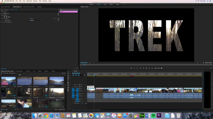
This is the presentation for my unit 8 FMP project that I presented to the class.
I felt that the presentation went well even though my idea wasn’t chosen to be made.
This week I began by finishing the colour correction by using the advice of the focus group I conducted towards the end of last week. The main points that they picked up on were
- make the exposure throughout the shots more consistent
- lower the highlights
- raise the shadows
- raise the saturation
- fix the continuity error with the sunset by grading it too look daytime
Now that I had this information I went into the editing suite and I fixed everything about the film that I was advised to change. I started by raising the saturation in the images near the beginning as suggested by three of the four people in the focus group.
Before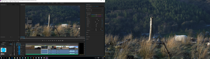
After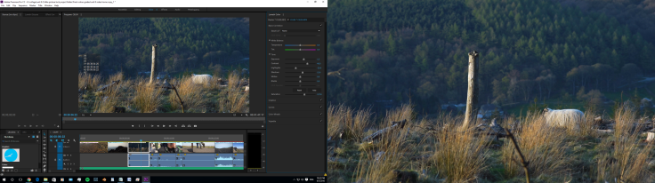
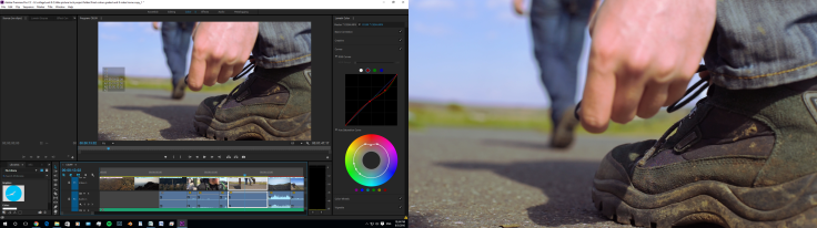
When I raised the saturation in some of the shots, I found that it made some of the greens and reds (especially the skintones) seem fake so I corrected the individually after the saturation raise. For example in this shot where the characters hand is in shot, when the saturation was raised the had was too re so I brought the saturation levels in the reds to fix the colour of the hand.
I then went on too correct the inconsistent exposure throughout the film. I went through the film several times adjusting the overall exposure to a level consistent throughout. I dropped the highlights slightly in some of the higher exposed shots and generally brought the shadows up in most shots as this was also a problem stressed by the focus group.

The last thing that I fixed with the colour was the continuity error with the sunset shot. I pulled the colour temperature of the entire shot more towards the cooler blue side which lowered the orange sky. I then raised the saturation of the blues and lowered the saturation of the oranges and too finis it off I slightly raise the exposer and boosted the shadows and highlights. This made the shot seem like it was more in the middle of the day.
Before

After

As a few of the people from the focus group expressed concerns about the end title I decided to change it. I thought as this was an adventure film about the peak district for the peak district national park that I would use one of there logo’s as the title. I went on there website (http://www.peakdistrict.gov.uk/) and found there logo.

I then went on google images and found three different variations of there logo and brought them into Premiere Pro. I then brought them into the timeline and looked for the highest resolution one and the one which would be easiest to work with. I decided on the orange one because it was the highest resolution and it would be the easiest to make the text white.
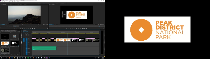

I then brought the image into Photoshop and inverted the colours I then raised the contrast and lowered the saturation this made it grey and lighter grey. I then raised the brightness to make it grey logo and black background, then I inverted the image again making it white background and grey text and raised the contrast making the text black. Once I had done this I painted black around the edges of the frame and then exported as a JPEG at 1920 x 1080 pixels so it matched the video footage in Premiere Pro.

I then brought the edited version into Premiere pro and resized the photo using the motion tab in the effects panel to make it look the right size. Now I just added cross dissolves and timed the clip to size and the film was finished.
showed the film to the focus group again and they said that they like the changes and that it make the film better and look more professional. Here is the final film.
Now that I had finished the film, he last thing to do was the evaluation. I spent the rest of the week evaluating my film and the entire production process. I felt that this helped me because it showed me what I had done well during the production process and what I could do better next time I embark on a project.
The impact that this week has had on my project is that i’ve improve the final film by improving the film based on the opinions of the target audience. I think that I did the improvements too the colour and exposure of the film very well. The exposure is now more consistent throughout the shots in the film and the saturation is higher making it more visually appealing to an audience yet its not over saturated making it look fake. I think that my main arias for improvement this week would be to have done more research into more complicated colour grading techniques that could have pushed the look of the final film even further. The main problem that I solved that i’m most happy about is that in one of the shots where there is a close up of the characters hand, when I raised the saturation the skin tones looked fake so I figured out how to isolate and individually control the saturation of each shade of colour so I could lower the reds and the blues and raise the oranges to make the skin tone of the hand look true too life. This week my main learning point has been how to evaluate my project. Until this project I didn’t know how to properly evaluate my films or the projects but with help from my lectures I leaned how to do so.
Primary research into the codes and conventions of adventure films
To start my research and come up with ideas for the production of my film I visited the SHAFF (Sheffield Adventure Film Festival) where I watched a series of climbing films, skiing films, mountain biking films and general adventure films. this was very useful as it gave me a sense of the kind of style of editing and film making that I would need to achieve. I realised that the most successful films had a slight storyline and a connection to a person rather than just beautiful cinematography. But they did include very cinematic landscape shots.
Primary research into recording techniques
Sound recording –
The next step with research for the fmp was outdoor sound recording research. I know that at some point in the film I will be recording sound outside and this sound may be interviews. Ive recorded interviews indoors before and can do it well but i’ve never recorded interviews in windy noisy conditions before. I started by recording sound from a normal position but the boom was too high so it picked up allot of wind noise. I then tried with the boom really low down which meant that not much with was picked up. I then tried with a wind gag and without a wind gag on the microphone and like I guessed the wind noise was significantly reduced with the wind gag on. The last thing I tried to make the sound clearer was the positioning of the mic. I moved around to point the microphone at the person speaking but away from the sources of the background noise (the main road), this helped greatly and made the sound of the person speaking more defined from the background noise.
I found that the way to record the cleanest audio for an outdoor interview is to use a wind gag, hold the boom as close to the sound source as possible and point the microphone away from the direction of the background noise e.g. wind direction, people talking or traffic and also have the microphone low pointing up rather than high pointing down, this reduces wind noise. I will use this information in the production of my film by positioning the microphone away from the wind direction and use a wind gag. I will also set up the interview shot so that I can have the microphone as close to the persons mouth whilst still being in shot and the microphone down low so its out of the wind.
Research into target audience
The aim of my film is to show people the beauty of and encourage people to climb at Stanage edge. I need to find my target audience and what they like to make a more successful production. I have a rough idea of my target audience, I think that its going to be mainly 16-30 year olds with about 80% of them being male and 20 % being female. They will be outdoorsy people who have a slight to strong interest in outdoor rock climbing. I think there will be this gender divide because more males are interested in climbing which is what this film is about.
Im going to conduct a survey to get a more definite demographic and psychographic profile on my target audience. Then I will conduct another survey thats more specific to the target audience and about climbing videos. I will distribute theses surveys through social media, specifically Facebook. I will post it on my wall and get friends and groups to share the survey to get more results.
This is the link to the survey that I conducted on survey monkey.
https://www.surveymonkey.co.uk/r/QPN7ZC5
Results;
In total 18 people took my survey, they all answered every question apart from one person didn’t answer question 8.
For question 1 (how old are you?) out of the 18 people that answered, the majority age group was 17-20 with 83.33% (15) people being in this group. Under 16’s, 31-40’s and the 61+ categories all got 1 response.
—-
For question 2 (do you follow politics?) the majority of people (10) saying ‘a bit’ and 7 people saying ‘yes’ and 1 person saying ‘no’.
—-
For question 3 (do you Care about the environment 10 people said yes, 6 said a bit and 2 said no.
—-
For question 4 (Which social media websites do you use?) Facebook came in at the most popular with everyone using it, Instagram next with 94.44% of people using it, then Snapchat with 77.78% of people using it, then Twitter with 61% of people using it, then Flickr and Tumblr both getting 44.44% of people using it, then Whatsap with 33.33% of people using it, then Pintrest and Google+ both getting 22.% of people using it, then 500px getting 11.11% of people using it and finally 5.56% of the people use none of the above. From this I learned that I should distribute the film through Facebook and Instagram.
—-
For question 5 (Are you an outdoors kind of person?) 61.11% of people said they were a bit of both, 16.67% of people said they were an indoors person and 16.67% of people also said they were an outdoors kind of person and 1 person (5.56%) said they wish they had time to go outside.
—-
For question 6 (whats your favorite past time?)
6 people said creative
3 people said relaxing
Ball sports, outdoor activities and sailing all got 2 people selecting them
Cooking video games and seeing friends all got 1 person selecting that choice.
The rest didn’t get selected.
—-
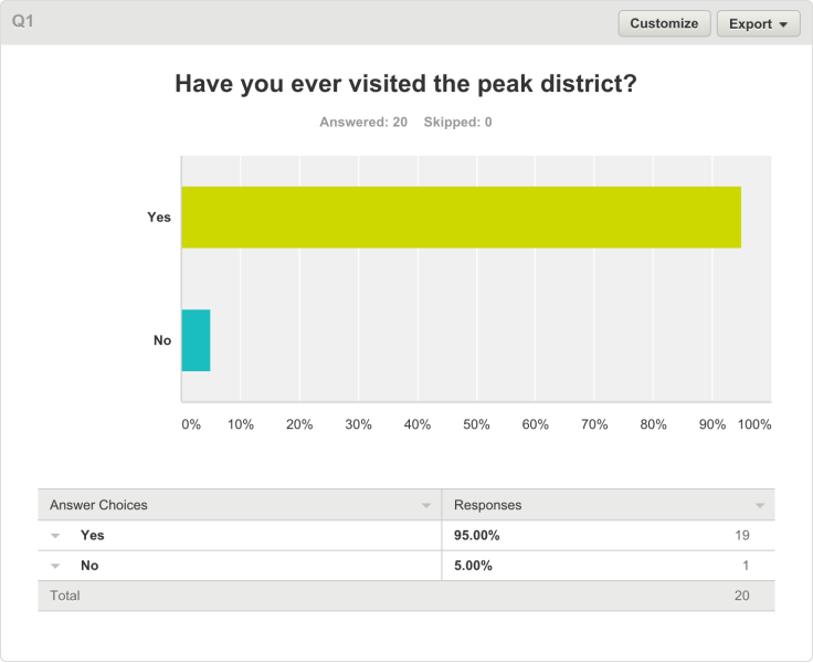
For question 7 (have you ever visited the peak district?)
15 people (83.33%) said yes.
1 person said no, 1 person said they had never heard of it and 1 person said no but they wanted too.
—-
For the last question, question 8 (where do you live?)
11 people (64.71%) of people said they live in the suburbs, 1 person (5.88%) of people said they live in the countryside and 5 people (29.41%) of people said they lived in the inner city.
What I got from this information?-
As my film will mostly be distributed on social media like Facebook I distributed the survey on this platform, this meant that I could get an idea of the kind of person that will see the video. The kind of person that will see the video on Facebook will be in the 17-20 year old age bracket, they will mostly only follow politics a bit and generally care about the environment. Because of this I will aim the film mostly at this age bracket by using a climber in this age bracket so they can relate to the subject better. They will definitely use Facebook and probably use Twitter, Instagram, Flickr, Snapchat and Tumblr. Because of this I will distribute the film on these Social media platforms because these are the most popular social media platforms for the age bracket i’m targeting the film at.
They will be a kind of outdoor person that doesn’t go out side as much as they would like too and they play ball sports, go sailing and like other outdoor sports and sometimes creative activities. I will make the Peak district look as appealing as possible in the film to encourage the people that want to go to the peak district more actually go and take part in sports and activities outside. Most of the people said that they lived in the suburbs but had visited the Peak District, I will have to show very interesting angles of the peak district that they usually wouldn’t have seen before to make it more interesting. I also will have to make it look really appealing as most of the target audience live in the suburbs meaning its harder for them to get too the peak district so it would have to be worth there while to travel there.
Film specific research
After finding out about the target audience for the film that I will make I decided to make a survey that’s more specific to climbing and short films to help find out more information that may help with its production.
This is the link to the survey https://www.surveymonkey.co.uk/r/PF6KJJK
20 people filled out the survey, everyone answered all the questions apart from one person who missed the last question.
The results;
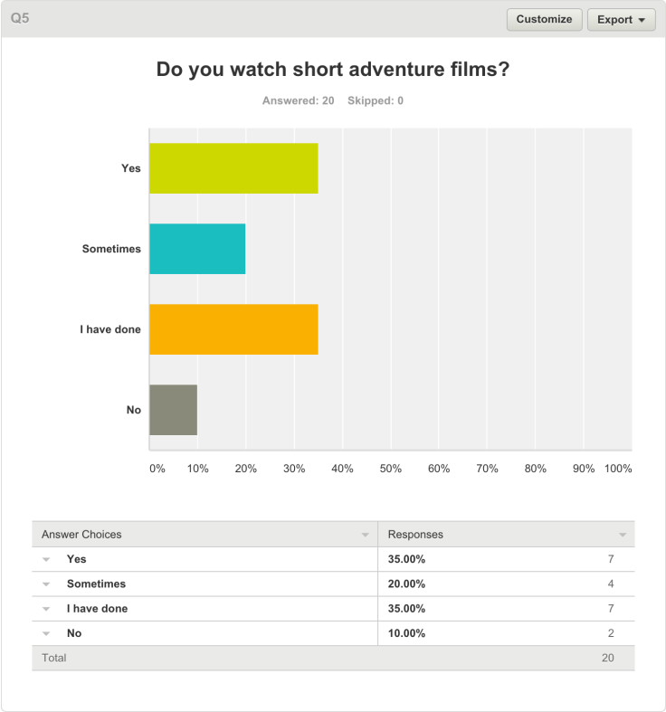
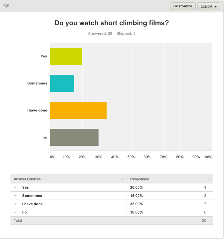


What I learned from this-
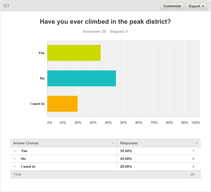
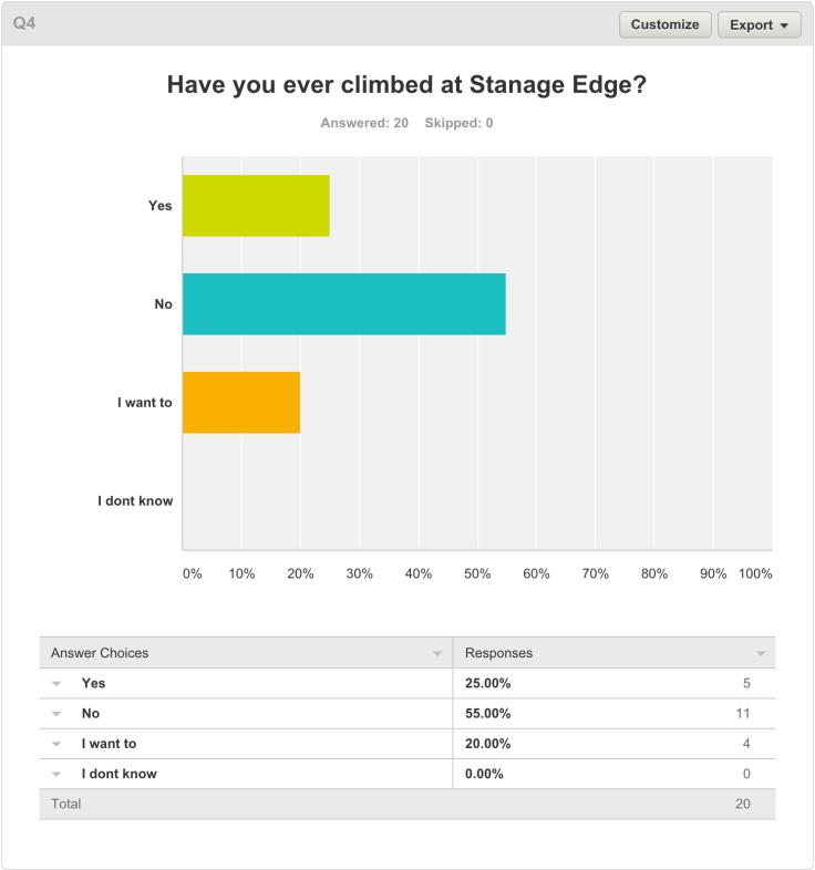
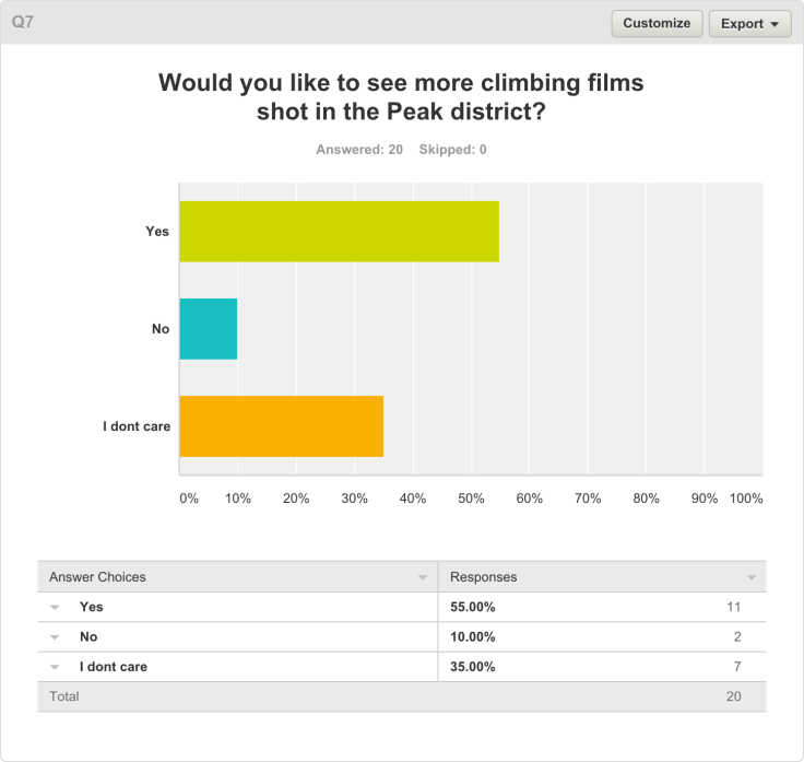
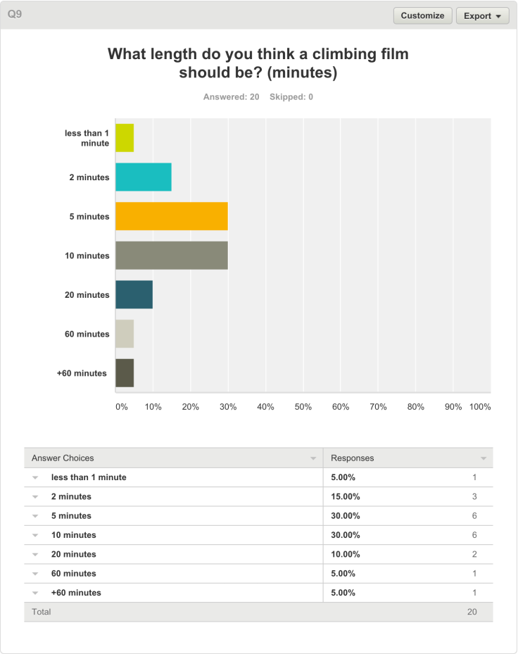
From this I learned that most of my target audience have visited the Peak District but most of the people that are climbers haven’t ever climbed in the peak district or at Stanage edge. I also found out that most people have seen short adventure films and climbing films before but don’t regularly watch them, they also would like it if more short films were shot in the peak district but were unsure weather films about non-pro climbers would be interesting. The target audience also said that the length they though that a short climbing film should be is between 5-10 mins, they also said that a short film will hold there attention for 5-10 mins but some said only 2 mins.
What I will do with this information-
As most people haven’t ever climbed at Stanage edge before i’m going to make climbing there very appealing by featuring very good looking climbs which are challenging and have good surroundings and easy landings, this will encourage more people to come and climb at Stanage edge. The target audience also said that they weren’t sure about seeing non-pro climbers so I will have to make my climber look really good to keep the audience interested. I will also make the film about 5 minutes long as the audience said the ideal length was 5-10 minutes long. As they some people said that a short film will only hold there attention for the first 2 mins I will have to start the film with very visually pleasing images to make sure they stay interested and watch the whole film.
Codes and conventions of an adventure style advert.
Textural analysis of a visit Wales advert;
The Opening few shots are a 4 aerial shots facing straight down. These are of a lake, the sea, a mountain and a coastline. They are all the establishing shots for the advert to signify the importance of the location. They are all used as the establishing shots to show that the setting for the advert is outdoors but will be shot in similar but different locations. The locations are all in Wales and this is because the advert is to encourage people to visit Wales. All the Locations in wales are in the countryside or other arias of natural beauty like the coast or the mountains or the picturesque village of Portmerion, this is because the aim of the film is to sell Wales and the director will want to make use the most beautiful locations to make it more appealing to the audience. The opening 4 shots are cut together quickly to keep the audience hooked until the music starts and the main section of the film begins. This is helped by the harsh changes in noise between shots, which consist of wind noise in the mountain shots and the sound of the sea in the coastline shots. The wind sound is digetic to help put the audience in the location.

The next section of the film is a sequence of rapid cuts of camping scenarios. First a pot boiling on the camp fire, then a tin of beans on the camp fire then an egg cooking on the camp fire. This is shown too bring the viewer into the location and show whats going on in the scene. This is followed by two shots of a group of people camping. This fast pace editing is used to make the audience excited and look forward to the rest of the video.
The next part of the film is set in a different location. It’s all set on a lake and this scene is established by three wide shots, the first two of people kayaking and the other a wide of what looks like a farther encouraging his son to jump into the lake. This is then followed by a close up of the boys face; this close up is used to bring the audience in closer to a character and in the case of this film make them want to be there by surrounding the clip with beautiful exciting shots.
The next scene is again a different activity in a different location, this time horse riding on the beach. The scene is established with an aerial shot looking directly down like in the first shots of the film, this shot is a very interesting angle and is used to keep the viewer interested. The next few shots are quickly cut together close ups of the people and the horses to bring the viewer right into the action and then are followed by a wide showing the scenery to show where the action is taking place.
This scene compared to the previous scene was graded with a warmer look too it than the previous scene. The previous scene give a cooler, more real life non cinematic look to the shots which makes it look more adventurous which is what the scene is about whereas this scene has a warmer/ pinker grade to it making it look more dreamlike and surreal. The director would have chosen the grading to be different in the two different scenes so that parts of the film appeal to different people. The previous scene will attract a more adventurous type of person typically being a man which is reinforced by males doing the adventurous activities whereas the next scene is warmer and more peaceful features women riding horses on the beach which is stereotypically a more feminine activity. This gender stereotypes and colour grading to match is intentional to make the film apply to the most amounts of people and attract the most amount of people to Wales.


The following shot is another establishing shot for the next scene which features five people carrying sea kayaks with the sea at sunset in the background. The director always starts the next scene with a very different establishing shot; this is because all the shots and scenes are so quick that it would be confusing if the re wasn’t a definite establishing shot between scenes to separate the activities. The next shot in the scene feature a group of people sat on a wall all laughing and smiling all wearing kayaking clothing suggesting what thy do next with is go kayaking. Some of the following shots are POV shots to give the perspective of the characters in the film and bring the viewer right into action which works well with the characters in rough waters kayaking because it will make the more adventurous viewers wasn’t to join in.
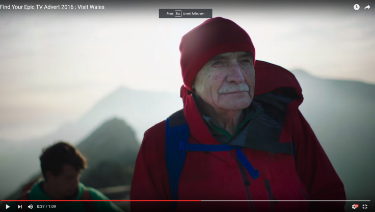
For the Next scene the activity changes a bit and its unclear what the character sill be doing from the initial shots of the scenes. It starts with a car driving down a country road and then a close up of them looking at a map, the close up is to not give anything away too early to build up tension and keep the viewer interested. The following shot being the character coiling a climbing rope hinting at the activity and then the following shot is a wide of them climbing up mount Snowdon finally showing the viewer the activity. This method of not revealing the activity builds up a sense of anticipation and this is topped of by the following shot being a low angle of the climber finally summiting the peak and showing all of Crib Goch, Mount Snowdon and the huge surroundings. The high angle shot gives another interesting perspective making the characters looks small to show how big the surroundings are.
Two of the following shots are of a dog on this climb and an old man. The shot of the old man is a medium close up with the mountain as the back drop and is used to make sure the viewer is aware of his age and these are again to make the film apply to a wide array of people and include the older generation and encourage them to go out and do some of the activities they wouldn’t have thought they could do by showing an old man at the top of a mountain he just climbed.
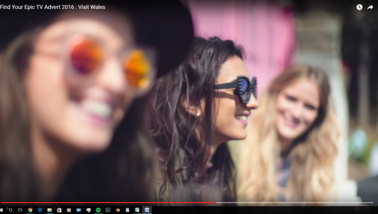
The next scene is also established by an aerial shot and this is to make the viewer aware that this is again a completely different environment. The previous shot was an aerial shot of the mountain with the climbers on it and then the following shot was also a drone shot but this time showing a festival in a more built up aria. The following scene has a different more party style to it as it’s of a festival. This was included in the video to include another style of activity that would encourage a different type of person, the type of person that doesn’t do adventurous outdoors activities but enjoys more music festival and hanging out with friends kind of activities which tend to appeal more to women than men; this is why the scene features women and has a more pink tint to the colour grade and the colours are more saturated because it will make the event look more appealing to that kind of person and make them want to visit more which is the aim of the film. Throughout the scene it features people smiling and laughing to make the place seem nice and appealing. In the shots in this scene it’s much sunnier compared to the previous scenes because this scene is all about people being happy and the sun shining tents to be associated with people being happy.
The film ends with a shot of a group of people sat on a rock with a blanket around them at sunset. This shot was used at the end of the scene because the sun is setting meaning that the film was in chronological order. The final shot is an areal shot looking straight down which is the same as the first shots of the film. This is to tie the whole film back together and end it. The word Cymru fades over the top of this shot, this reinforces that it’s about Wales because it the word Wales in welsh. The text then fades to Wales in English so English reading people can actually understand what it means. The final image is the red dragon from the welsh flag and the visit Wales website address. This is the convention for an advert as the company will want
Location recce
To make sure the filming day goes smoothly the director, the sound designer and I all went on location recces ahead of the shoot to figure out exactly where we will shoot the different scenes for the film.
The first place we went too was the woods at surprise view. We were going to use these woods as the setting for the camp scene towards the end of the film. This is where the woods were 
We found when we got there that the woods were not a suitable location for the filming even though it was so close to the road and had easy access. The woodland wouldn’t match any of the other walking scenes through woods as these woods were mainly silver birch trees and were very spread apart. The director and I decided that these woods were not the look we were going for and we would look at the other location we had in mind.
—-
The next place we looked at was the woodland above Ladybower reservoir, near the top of Win Hill. This is where it is
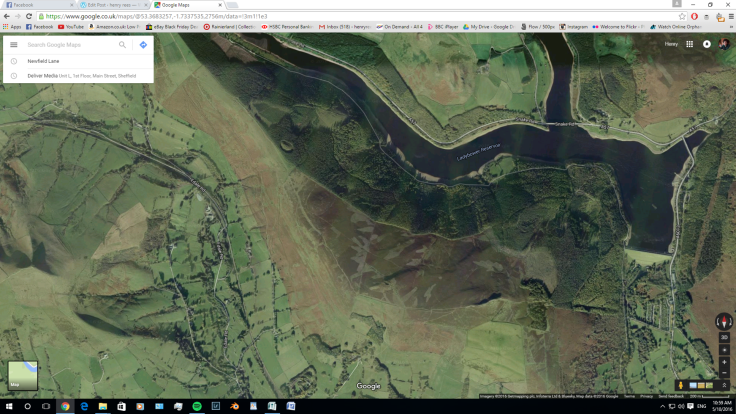
This location was almost perfect. It had the right look and atmosphere I was looking for. The only problem with it was it was an hour walk away so ti was quite difficult to access. The director an I decided that we would use this location as it would look best for the film.
—-
The next location we went too was the beach. It was the rocky beach shore of Ladybower reservoir. It was perfect for the stone skimming scene, it had beautiful landscape background looking over the water. We decided we would definitely use this location.

—-
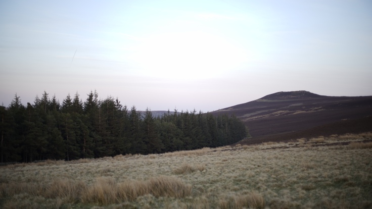
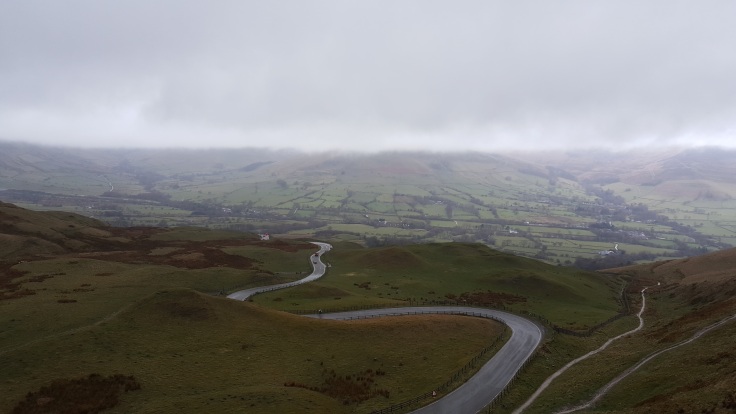
After this we visited Mam Nick hill above Castelton. We decided that as long as the weather was nicer on the shoot day that the location would be perfect. We found 3 locations for filming on the hill.


—-
On the way to the last location we drove down Whinnits Pass and decide that it would be a really good place to show the scale of the places in the peak district. We stoped and went too look at the place and we found a great spot to take a shot from. The director decided that we would use this location if we had extra time whilst filming at Mam Nick which is nearby.
—-
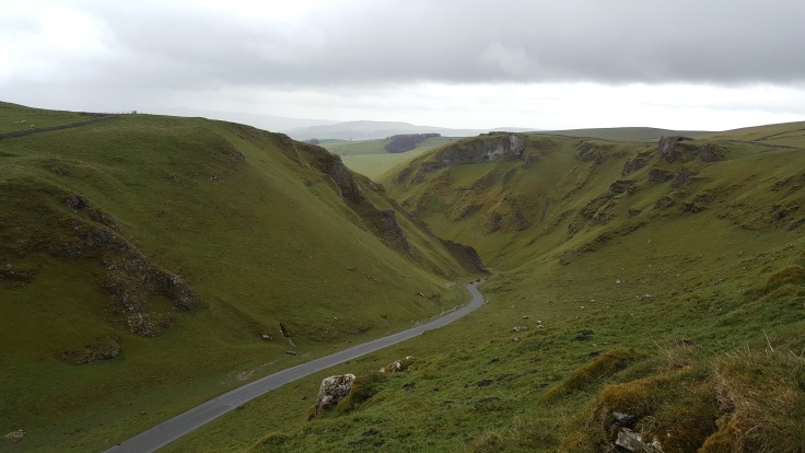
The last location we visited was Padely Gorge. On a nice day the location would look brilliant and exactly what we wanted.
—-
We never got time to look at Stanage edge or Curbar edge for the far away walking shots but I’ve visited the locations loads of times before for filming and sport so I had a pretty good idea of where to shoot whilst there and know that either will do for what we need to film.
the final schedule that we came up with whilst working with other groups in my class to find out the best way to get everyone to there locations is
Wednesday AM- Castelton/Mam Nick
Wednesday PM- Ladybower (the beach)
Wednesday Evening – Ladybower (woodland)
Thursday AM- Curbar edge
Thursday PM- Padely Gorge
We couldn’t use Stanage edge for filming as it was to far away from anywhere else that other groups were filming at so we would have more time to film if we went to Curbar edge as it would take less time to get there.
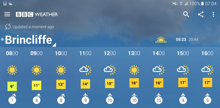
I checked the weather forecast for the shoot days (Wednesday the 4th of may and Thursday the 5th of May) the weather forecast looks very good for those days which is good because it will be bright and happy which is the look i want in the film. As it will be bright I will pack ND filters so the shots wont be over exposed.

Initial Post Production Research
I first started my research into colour correction and grading by watching this YouTube tutorial on how to use the Lumetri colour panel in Adobe Premiere Pro. This was really helpful as it taught me everything that I would need to know about working with colour in that program at my skill level.
Next I found another YouTube video which explained in general colour grading and what effect certain changes make. This is the video
I then did some research into colour correction and grading in adverts. Noam Kroll, a professional colour grader for commercials said:
‘As far as color is concerned, commercials are all about the midtones. This is especially true of commercials that feature talent and aren’t simply a montage of product shots. In a narrative film, it’s perfectly okay (or in some cases even encouraged) to place mid tones/skin tones in a unique place.
For instance, you might be creating a really moody scene and want your actor’s faces to be underexposed, and you might achieve that by bringing down your midtones significantly… But on a commercial project you would almost never do this.
Commercials almost always benefit most from accurate, neutral, and pleasing midtones that are a touch on the bright side. Since the talent in any given commercial is essentially there to sell a product (even if the commercial isn’t pitchy), their appearance needs to be inviting and attractive, and the first step in achieving that look is by color correcting the mid tones in a way that brings up your talent’s skin to an optimal point.’
Noam Kroll. 2015. The Best Practices for Color Grading Commercials. [ONLINE] Available at:http://www.premiumbeat.com/blog/the-best-practices-for-color-grading-commercials/. [Accessed 5 May 2016].
From this I learned that I need to make the picture attractive by raising the midtones to an optimal point and make the skin on the talents faces to have accurate colour and exposed correctly or slightly over exposed.
Font Research
this I began research into the font that I will use for the titles at the end of the film.I went on adobe Typekit website and the Premiere Pro font list to research some fonts that I may like to use. I found 4 Typkit fonts and 1 Premiere Pro fonts that may be suitable to use, they were


I then went on adobe Typekit and the Premiere Pro font list to researched some fonts that I may like to use. I found 4 Typkit fonts and 1 Premiere Pro fonts that may be suitable to use, they were


I decided to go with the Premiere Pro font, Leelawadee UI as I thought it looked the most professional and easy to read.
Further Post production Research
I needed to stabilize some of the shots as they were too shaky and didn’t look right in the film. I looked on YouTube and found a video that told me how to do this. This is the link too the video tutorial
Focus group after initial cut and colour grade
Once I had finished the first colour grade I decided to do a focus group. I found four people in the target audience age range who knew about cinema, cameras and colour. I then got them to watch through the film and critique the colour, composition and camera work as this was my role in the film and I needed to know what the target audience thought about the initial cut and colour grade of the film so I could make changes if necessary.
The first person was a 17 year old freelance film maker called Morgan. He said that he really liked the use of shallow depth of field with the long telephoto shots, especially the shot of the bird but thought that some of the shots (mostly the over exposed/brighter shots) were too under exposed for the genre and look of the film. He also thought that some of those shots were too over exposed and could do with the highlights bringing down. Unfortunately he did pick up on the use of old lenses that had allot of dust in them and suggested bringing the clips into Adobe After Affects to clean them up. the last thing he though could have been better in the film was the time of day continuity error where the walkers go from the middle of the day too sunset and back too the middle of the day in 4 shots and thought that this could be fixed in the colour correcting suite.
—-
Next I asked an 18 year old photography student called Ben. He thought that there was allot of inconsistency with the colour and exposure throughout the shots in the film and thought it would be best to make them more consistent. He also thought that at 42 seconds into the film the shot of one of the character from the rear draws the viewer away from the character and isolates them and that it should have been a shot looking straight on. He also didn’t like the font used for the Peak District National Park title as he thought even though its the same font as the rest of the titles it doesn’t match and looks out of place and less professional.
—-
Thirdly I asked a 17 year old film student for his opinion on the film. He started by saying straight away that he liked the colours as he thought they looked true to life but picked up on the fact I was shooting at a high frame rate an thought this let down the close up shots as it made the movement look unrealistic. He then gave me some bullet point tips
- near the beginning the colours are slightly muted/under saturated
- the shadows were a bit too dark
- seconds in the shot is over exposed
- tighter shot of the fire would have been better at 1:25 in to the film
He then said that he thought that the use of the tripod to get a steady shot at 33 seconds in breaks the story through motion as most of the film is handheld and this is a key part of linking the viewer to the characters and the tripod use breaks this. He also said that he liked the shallow depth of field and the shot of the character walking along the ridge line. He also added that he didn’t like the end title and said it should be changed.
—-
Lastly I asked an 18 year old film student called Jake about the film. He didn’t comment much as he was busy and had to be somewhere but said ‘Looks great!!! The only thing I noticed straight away is there are a couple of shots at the start that are just large expanses of brown. Also, in a lot of the walking shots, your highlights are very hot, and your subjects are a little under exposed, I think you just need to crush the highlights and pull the image up a little’.
—-
From all this I think that the advice that i’m going to take that I can change now in the post production stage and use it to fix the film will be-
- make the exposure throughout the shots more consistent
- lower the highlights
- raise the shadows
- raise the saturation
- fix the continuity error with the sunset by grading it too look daytime
- change the end title
This week I Began the colour correction and grade for the film. I got the hard drive with the Premiere Pro project on it from the director. The film was at picture lock when I received it. Using the research that I found teaching me how to use the program to manipulate colour and light I began by correcting the exposure of the clips to match the exposures the best that I can and make them look realistic.
 before temperature and tint adjustment
 after temperature and tint adjustment
I was going for quite a warm look with the film as I thought that it was quite an attractive advert like look that would appeal to the viewer.
Once I had adjusted the colour I applied the warp stabiliser affect that I found out how to do through secondary internet research about stabilising video. I found that some of the shots were too shaky to completely remove the unwanted movement so I removed it as much as possible without the warp stabiliser affect being noticeable. Once the stabilisation, colour and exposure adjustments were complete I started on the titles for the film. I started with one Idea and ran it through with the director but we both agreed it didn’t look good. This was the first idea
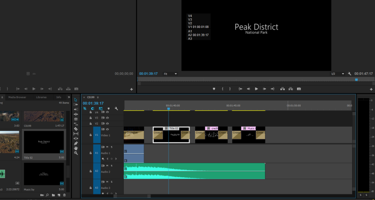
We then decided that a simple more professional looking title at the end would suit the film better. I then made up 3 titles, one that said Peak District National Park, one that was the credits for the crew and one that was the credits for the music creator.


The director and I then watched through he film and we were both happy with it so I exported a low resolution 720p version of the film and gave it to the sound designer and then a few days later he gave me the sound file. I then added the sound file onto the timeline and exported the high resolution version of the film.
This is the first export of the film
Once I had finished the first colour grade I decided to do a focus group. I found four people in the target audience age range who knew about cinema, cameras and colour. I then got them to watch through the film and critique the colour, composition and camera work as this was my role in the film and I needed to know what the target audience thought about the initial cut and colour grade of the film so I could make changes if necessary.
The main points that they picked up on were
- make the exposure throughout the shots more consistent
- lower the highlights
- raise the shadows
- raise the saturation
- fix the continuity error with the sunset by grading it too look daytime
The impact on the project that I made this week was that I gave the film its look and made it look more professional. I also made sure that in the aria that I was responsible for (the look of the film) that it appealed to my target audience, I did this by asking a focus group about it who wee all in the target audience. I think one of the thing that I did really well this week was my use of primary research to find out the thoughts of the target audience to improve the final film. I think that I could improve greatly on my colour correction and grading skills, this would be done through a lengthy process of secondary research and mainly experience using the program. This week the main thing that Ive learned to do is lean to use the colour wheels in Premiere Pro to individually control the saturation of each colour.
Next week I will be finishing off the colour correction based on the views of the focus group and the I will be completing my analysis.
Initial Post Production
The director gave me the picture locked project on a hard drive with all the original clips on it and the project folder meaning I could do the colour and titles on a different machine. I started by doing the colour correction. I learnt how to do this using the video tutorial on how to use Adobe Premier Pro and my prior knowledge of Adobe Lightroom which is very similar and my further knowledge of the Adobe CC suite. I started going into the colour tab at the top of the window which opened up the Lumetri colour panel on the right.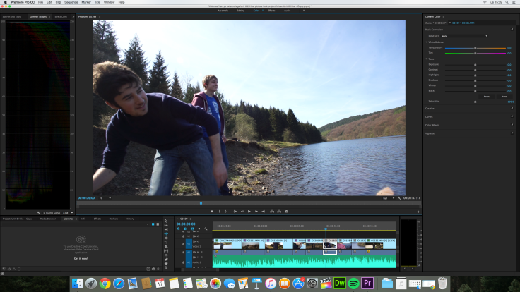
I initially started to adjust the shots in chronological order but found it was much quicker and easier to apply the same corrections to similar shots so I did so and this meant that the rest of the shots that were similar only needed tweaking a small amount. Once I had corrected the shots I started applying a creative look to the shots. The look I was going for was a cinematic warm feel with a teal tint too the shadows, I felt that this would make the picture more appealing, therefore drawing the viewers in and making the Peak District more appealing meaning ore of the viewers would want to visit which is the point of the film.
Before and after the colour grade and correction.


Once I had been through and adjusted the colour and exposure an all the shots I had to correct for the shakiness of some of the shots. I didn’t know how to do this so I had a look on YouTube and found this video which taught me how to apply a warp stabilizer to the shots. https://www.youtube.com/watch?v=pJWPyE6NfmE. I followed this and applied the correct warp stabilizer affects to the required shots, these were on the long telephoto shots that weren’t steady enough on the tripod, the Steadicam shots and the handheld shots.
After this I started with the titles. I tried A title at the beginning with the original name for the film (Trek). 
I spoke with the director about this and we decided that it didn’t work and we should just call the film Peak District National Park an place the titles at the end all together.

 I then went on adobe Typekit and the Premiere Pro font list to researched some fonts that I may like to use. I found 4 Typkit fonts and 1 Premiere Pro fonts that may be suitable to use, they were


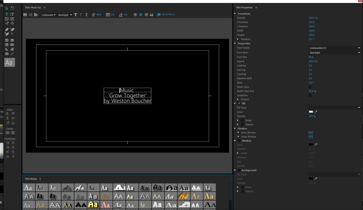
I decided to go with the Premiere Pro font, Leelawadee UI as I thought it looked the most professional and easy to read. I then made 3 titles, one for the name (Peak District National Park)
The next was all the credits for the crew
and the last was the music credits for Weston Boucher
I then placed all the titles into the timeline, adjusted the lengths to make sure they didn’t go on for too long but allowed enough time for the audience to read them, I then added fades to make the transitions between them easier on the eye.
I ran the entire edit through with the director and the sound designer to make sure that everyone was happy with it and they were so I exported a low bitrate 720p version of the film and gave it to the sound designer on a USB stick so he could synchronise up all the audio files and synchronise the music to the video correctly.
This is the first cut and colour grade of the film
Further post production (amendments)
Out of all the advice I got from the focus group, three of the main points can be corrected at this point in the production. they are
- make the exposure throughout the shots more consistent
- raise the saturation
- fix the continuity error with the sunset by grading it too look daytime
I started by raising the saturation in the images near the beginning as suggested by three of the four people in the focus group.
Before
After
When I raised the saturation in some of the shots, I found that it made some of the greens and reds (especially the skintones) seem fake so I corrected the individually after the saturation raise. For example in this shot where the characters hand is in shot, when the saturation was raised the had was too re so I brought the saturation levels in the reds to fix the colour of the hand.
I then went on too correct the inconsistent exposure throughout the film. I went through the film several times adjusting the overall exposure to a level consistent throughout. I dropped the highlights slightly in some of the higher exposed shots and generally brought the shadows up in most shots as this was also a problem stressed by the focus group.
The last thing that I fixed with the colour was the continuity error with the sunset shot. I pulled the colour temperature of the entire shot more towards the cooler blue side which lowered the orange sky. I then raised the saturation of the blues and lowered the saturation of the oranges and too finis it off I slightly raise the exposure and boosted the shadows and highlights. This made the shot seem like it was more in the middle of the day.
Before
After
As a few of the people from the focus group expressed concerns about the end title I decided to change it. I thought as this was an adventure film about the peak district for the peak district national park that I would use one of there logo’s as the title. I went on there website (http://www.peakdistrict.gov.uk/) and found there logo.
I then went on google images and found three different variations of there logo and brought them into Premiere Pro. I then brought them into the timeline and looked for the highest resolution one and the one which would be easiest to work with. I decided on the orange one because it was the highest resolution and it would be the easiest to make the text white.
I then brought the image into Photoshop and inverted the colours I then raised the contrast and lowered the saturation this made it grey and lighter grey. I then raised the brightness to make it grey logo and black background, then I inverted the image again making it white background and grey text and raised the contrast making the text black. Once I had done this I painted black around the edges of the frame and then exported as a JPEG at 1920 x 1080 pixels so it matched the video footage in Premiere Pro.
I then brought the edited version into Premiere pro and resized the photo using the motion tab in the effects panel to make it look the right size. Now I just added cross dissolves and timed the clip to size and the film was finished.
I showed the film to the focus group again and they said that they like the changes and that it make the film better and look more professional. Here is the final film.
Once I had finished the first colour grade I decided to do a focus group. I found four people in the target audience age range who knew about cinema, cameras and colour. I then got them to watch through the film and critique the colour, composition and camera work as this was my role in the film and I needed to know what the target audience thought about the initial cut and colour grade of the film so I could make changes if necessary.
The first person was a 17 year old freelance film maker called Morgan. He said that he really liked the use of shallow depth of field with the long telephoto shots, especially the shot of the bird but thought that some of the shots (mostly the over exposed/brighter shots) were too under exposed for the genre and look of the film. He also thought that some of those shots were too over exposed and could do with the highlights bringing down. Unfortunately he did pick up on the use of old lenses that had allot of dust in them and suggested bringing the clips into Adobe After Affects to clean them up. the last thing he though could have been better in the film was the time of day continuity error where the walkers go from the middle of the day too sunset and back too the middle of the day in 4 shots and thought that this could be fixed in the colour correcting suite.
—-
Next I asked an 18 year old photography student called Ben. He thought that there was allot of inconsistency with the colour and exposure throughout the shots in the film and thought it would be best to make them more consistent. He also thought that at 42 seconds into the film the shot of one of the character from the rear draws the viewer away from the character and isolates them and that it should have been a shot looking straight on. He also didn’t like the font used for the Peak District National Park title as he thought even though its the same font as the rest of the titles it doesn’t match and looks out of place and less professional.
—-
Thirdly I asked a 17 year old film student for his opinion on the film. He started by saying straight away that he liked the colours as he thought they looked true to life but picked up on the fact I was shooting at a high frame rate an thought this let down the close up shots as it made the movement look unrealistic. He then gave me some bullet point tips
- near the beginning the colours are slightly muted/under saturated
- the shadows were a bit too dark
- seconds in the shot is over exposed
- tighter shot of the fire would have been better at 1:25 in to the film
He then said that he thought that the use of the tripod to get a steady shot at 33 seconds in breaks the story through motion as most of the film is handheld and this is a key part of linking the viewer to the characters and the tripod use breaks this. He also said that he liked the shallow depth of field and the shot of the character walking along the ridge line. He also added that he didn’t like the end title and said it should be changed.
—-
Lastly I asked an 18 year old film student called Jake about the film. He didn’t comment much as he was busy and had to be somewhere but said ‘Looks great!!! The only thing I noticed straight away is there are a couple of shots at the start that are just large expanses of brown. Also, in a lot of the walking shots, your highlights are very hot, and your subjects are a little under exposed, I think you just need to crush the highlights and pull the image up a little’.
—-
From all this I think that the advice that i’m going to take that I can change now in the post production stage and use it to fix the film will be-
- make the exposure throughout the shots more consistent
- lower the highlights
- raise the shadows
- raise the saturation
- fix the continuity error with the sunset by grading it too look daytime
- change the end title
This week I began by sorting through all the rushes with the director. We came to a final list of usable shots that were enough to make a film approximately 2 minutes long, he then went on to edit the shots together until it was at picture lock, he consulted me about certain aspects throughout to make sure that we made the best possible video.
Next I began the research for the colour correction and manipulation stage. I began by looking online and I found a very useful and informative video tutorial on how to use the Lumetri colour panel in Adobe Premiere Pro CC 2015 which is the program I will be using to colour correct in.
I then looked for advice from what professionals have said about the process. I found a web article where a profetional colour grader said
‘As far as color is concerned, commercials are all about the midtones. This is especially true of commercials that feature talent and aren’t simply a montage of product shots. In a narrative film, it’s perfectly okay (or in some cases even encouraged) to place mid tones/skin tones in a unique place.
For instance, you might be creating a really moody scene and want your actor’s faces to be underexposed, and you might achieve that by bringing down your midtones significantly… But on a commercial project you would almost never do this.
Commercials almost always benefit most from accurate, neutral, and pleasing midtones that are a touch on the bright side. Since the talent in any given commercial is essentially there to sell a product (even if the commercial isn’t pitchy), their appearance needs to be inviting and attractive, and the first step in achieving that look is by color correcting the mid tones in a way that brings up your talent’s skin to an optimal point.’
Noam Kroll. 2015. The Best Practices for Color Grading Commercials. [ONLINE] Available at:http://www.premiumbeat.com/blog/the-best-practices-for-color-grading-commercials/. [Accessed 5 May 2016].
After this I began research into the font that I will use for the titles at the end of the film.
I went on adobe Typekit website and the Premiere Pro font list to research some fonts that I may like to use. I found 4 Typkit fonts and 1 Premiere Pro fonts that may be suitable to use, they were
I then went on adobe Typekit and the Premiere Pro font list to researched some fonts that I may like to use. I found 4 Typkit fonts and 1 Premiere Pro fonts that may be suitable to use, they were
I decided to go with the Premiere Pro font, Leelawadee UI as I thought it looked the most professional and easy to read.
The last thing that I researched this week was how to stabilize video. I noticed whilst looking at the rushes with the director that allot of the clips were very shaky as allot were shot with long telephoto lenses, Steadicam or handheld. I found a video tutorial on how to fix this
The impact that this week has had on my final video is that I found out what font i will use in the video, I will correct the shots with the midtones being slightly over exposed based on the suggestions of the professional Noam Kroll to make the picture more attractive. I think that I’ve done well finding the font as it looks very professional and follows the exact look what the director and I wanted. I think That I could have dome more research into the type of style that I want with the film but I have a good idea of what I want already.
This week I learned that to make a picture attractive for an advert I need to make the picture attractive by raising the midtones to an optimal point and make the skin on the talents faces to have accurate colour and exposed correctly or slightly over exposed. I also learned how to use the Lumetri colour panel and how to stabilize video correctly and well in Adobe Premiere Pro CC 2015.
Next week I need too colour correct the film, give a look to the film, make and add the titles too the film and do a focus group to find out what my target audience thinks about my job doing the picture and colour and if I need to change anything.

Recent Comments