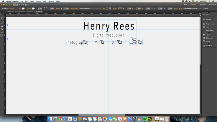
First I opened a new site in Adobe muse, I then opened up the A-master and set the background white colour to the hex value F0F0F0. Next I opened up Photoshop and created 6 separate images with the words; Henry Rees, Digital Production, Photography, Video, about and contact. These will be the menu buttons and the logo go to home button, They will be PNG files so that they can have an alpha background so the background white colours will match. The finished PNG files;


I then positioned them to make the header like I planed.
The next step was the social media links in the footer. I got the links from this website: http://www.land-of-web.com/freebies/icons/freebie-circle-flat-icons-retina-ready.html
For the footer I used the same blue that I got from the adobe colour picker which is 49A6B3. I then positioned and resized the social media icons.

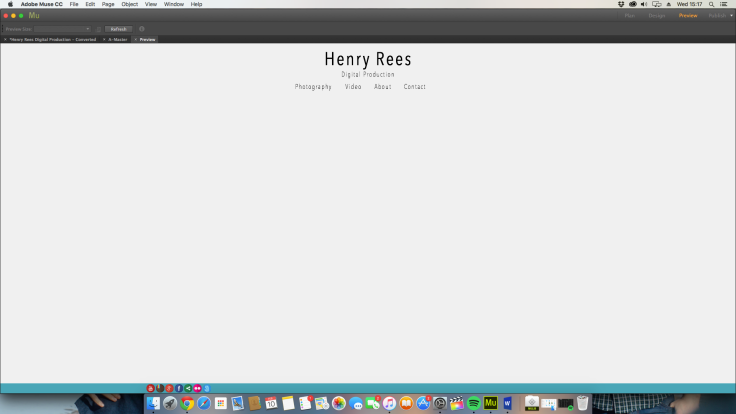
This is the master page done
I then started working on the home page. I inserted 3 basic slideshows form the adobe widgets library and modified it by deleting everything apart from the arrows which I gave a see through background and positioned them over the photos to make it look neater. I added 5 photos from my photography portfolio to each slideshow and set the slideshow to revolve every 5 seconds and for them to initiate at different times, one after the other with a 2 second difference.
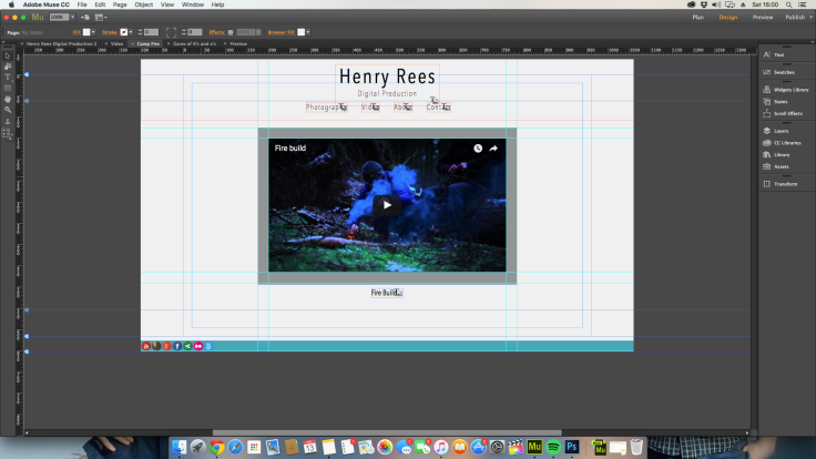
The next stew was making the video page. I draged the guidelines out to assist making three equal grey boxes. I then placed a slightly smaller thumbnail over each box, treating the grey box as a border.
I added extra pages coming of the page video and linked the thubmnails too the corect extension pages. On the extention pages I added a youtube player with a grey border like with the previous page.
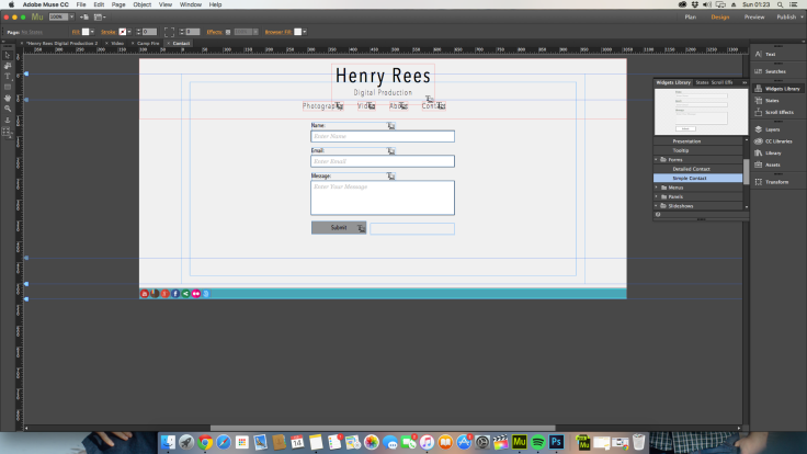
The next page was the contact page. I used the set adobe widget for this and placed it in the centre of the page. I chancged the font too match the rest of the site and temoved the border an filler to make it look simpler and sleaker. I made the text bokes pure white so there was acontast between them and the background so one could tell where to type.
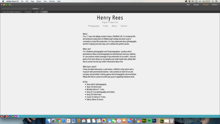
The second to last page was the about page, Again simple to do I juts insered a text box in the centre of the page like in my plan, set the font size too 12 and set the font to fit the rest of my site (Avenir next). I later found out that I couldent use Avenir next as it wasnt a web font so I changed it to Arial.
For the photography page I searched for a long time for a free widget that suited the style that I was looking for but I couldent find one so I had to buy one for $19.99 about £13.00. It was perfect for what I wanted. Its called LR deck http://resources.muse.adobe.com/products/lr-deck and linked to my Flickr account so I can manage the albums from my Flickr account.


Leave a comment